London’s Iconic Tube Map: From 1933 Design to Modern Sponsorships

The Design That Changed How We Navigate London
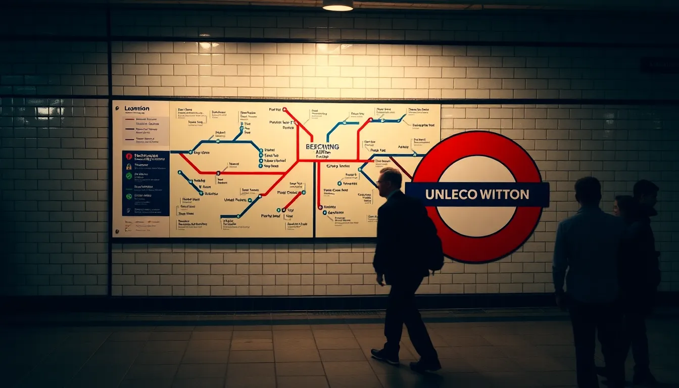
When Harry Beck unveiled his revolutionary schematic design of the London Underground map in 1933, he created something far more significant than a practical navigation tool. Nearly a century later, his elegant geometric lines and colour-coded system remain instantly recognisable—whether you’re standing at Trafalgar Square planning your commute or visiting from abroad. For the millions of Londoners who rely on the Tube daily, Beck’s map has become woven into the fabric of our identity. It’s the design we see on tote bags, posters, and in the minds of anyone trying to get from Soho to their destination. The map’s enduring legacy speaks to the power of good design: functional yet beautiful, practical yet iconic. What makes this particular piece of London heritage so remarkable is how it continues to evolve while maintaining its essential character. Every new station addition, every colour refinement, sparks conversation among residents who feel a genuine sense of ownership over this shared symbol. The map isn’t just infrastructure—it’s a cultural touchstone that connects us all to the city we navigate daily.
Advertising on the Underground: Not a New Trend
Recent debates about corporate sponsorships on the Tube map—with brands like MBNA and IKEA featuring prominently—might suggest that commercial branding is a modern intrusion into a pure design classic. However, Transport for London insiders and design historians know a surprising truth: advertisements have been part of the Tube map since day one. The original 1933 maps featured bold commercial endorsements that would make today’s subtle logos seem quaint by comparison. Peter Robinson, the Oxford Circus department store, had its location conspicuously circled and enlarged directly on the diagram. George Cohen, Sons and Company, a North Acton scrap metal merchant, proudly displayed its showrooms in a bright red rectangle. These early ‘overprints’ reveal that London’s entrepreneurial spirit has always intersected with our most iconic public designs. Surviving examples of these vintage sponsored maps are remarkably rare today—most were simply discarded after use—making them invaluable windows into how commerce and culture intertwined during the Tube’s formative years. Understanding this history helps us appreciate that the map has always been a living, evolving document reflecting London’s economic and social landscape.
Your Chance to Explore This Fascinating History
If you’re curious about how London’s most famous design has evolved over the decades, the upcoming London Map Fair offers a rare opportunity to see these historical treasures firsthand. Hosted by the prestigious Royal Geographical Society and curated by the Altea gallery, this exhibition brings together remarkable examples of early sponsored Tube maps that few Londoners have ever witnessed. The fair is completely free to enter, making it an accessible experience for design enthusiasts, history buffs, and anyone wanting to deepen their connection to London’s heritage. You’ll discover how the iconic map has always served as more than just navigation—it’s a document showing which businesses mattered to our city, how our commercial landscape has shifted, and how brilliant design can capture the essence of a place. Whether you’re a long-time Londoner or someone visiting our london attractions for the first time, this event offers genuine insight into the ingenuity and evolution that defines our city. Check the Royal Geographical Society’s website for specific dates and times. It’s a wonderful way to spend an afternoon discovering the layers of history beneath one of the world’s most recognised designs, proving that good design truly stands the test of time.
Source: London’s Tube Map: A Rich History of Iconic Design & Hidden Ads